Your landing page is more than just a digital doorway—it’s the engine that drives growth for your business. It’s the page that turns clicks into customers, traffic into trust, and browsers into buyers.
According to research, nearly half of marketers build a new landing page for every campaign they run. Why? Because focused landing pages convert 160% better than general website pages. A well-designed landing page has one job: to make visitors take action.
We’ve entered a new era of Landing Page Design—where psychology, personalization, and automation work together to deliver seamless user experiences. The best brands use design not just to attract attention, but to build trust instantly and remove friction at every click.
This article breaks down 10 best Landing Page Design Examples, showing exactly why they convert, what you can learn, and actionable tips to build your own winning page.
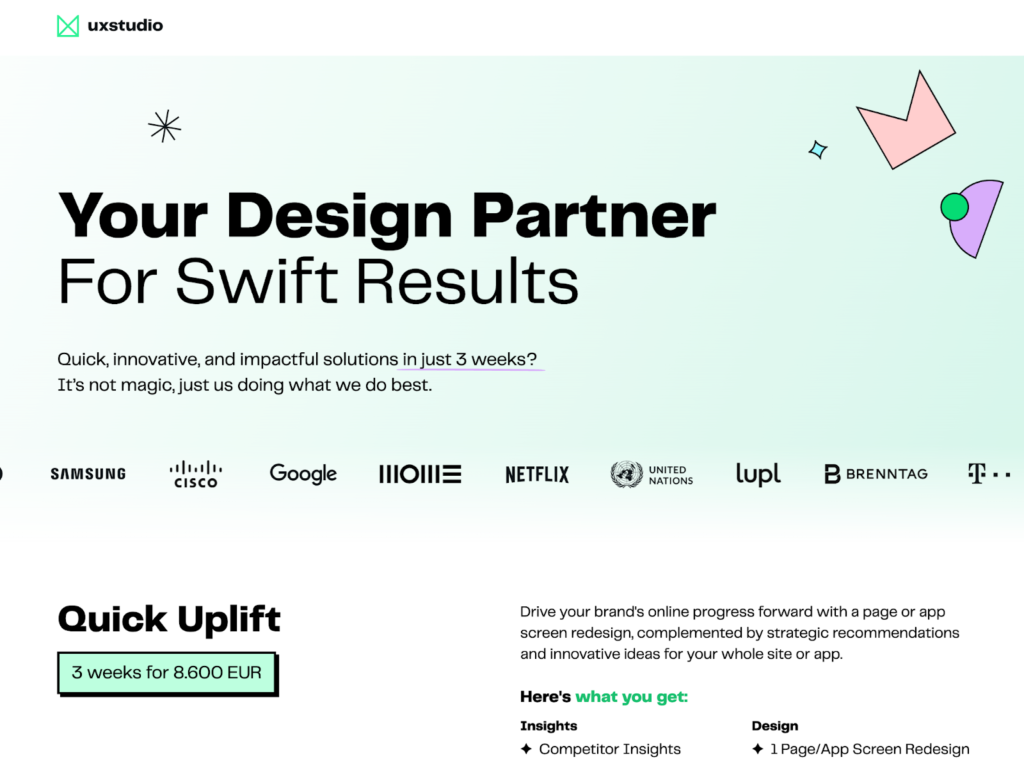
1. UX Studio – Simplicity Meets Conversion Power
Link: UX Studio link here
About the page:
UX Studio is a creative design agency specializing in UX optimization for web and mobile. Their “Three-Week Uplift” landing page highlights simplicity, value, and crystal-clear communication.
Why it converts:
- Minimalist hero: Clean layout, strong header image, and immediate pricing callout reduce uncertainty.
- Trust signals: Scrolling client logos deliver social proof quickly without clutter.
- CTA clarity: Using pricing as the primary CTA builds confidence and accelerates decisions.
SEO tip: Integrate semantically related phrases like UX optimization, user testing, and website conversion design to support topical authority.
Key takeaway: Keep the layout simple, the message direct, and the offer visible above the fold. Clarity builds confidence, and confidence converts.
Best for: UX consultants, SaaS designers, digital agencies.
2. SimpleTiger – Copywriting That Speaks to Pain Points
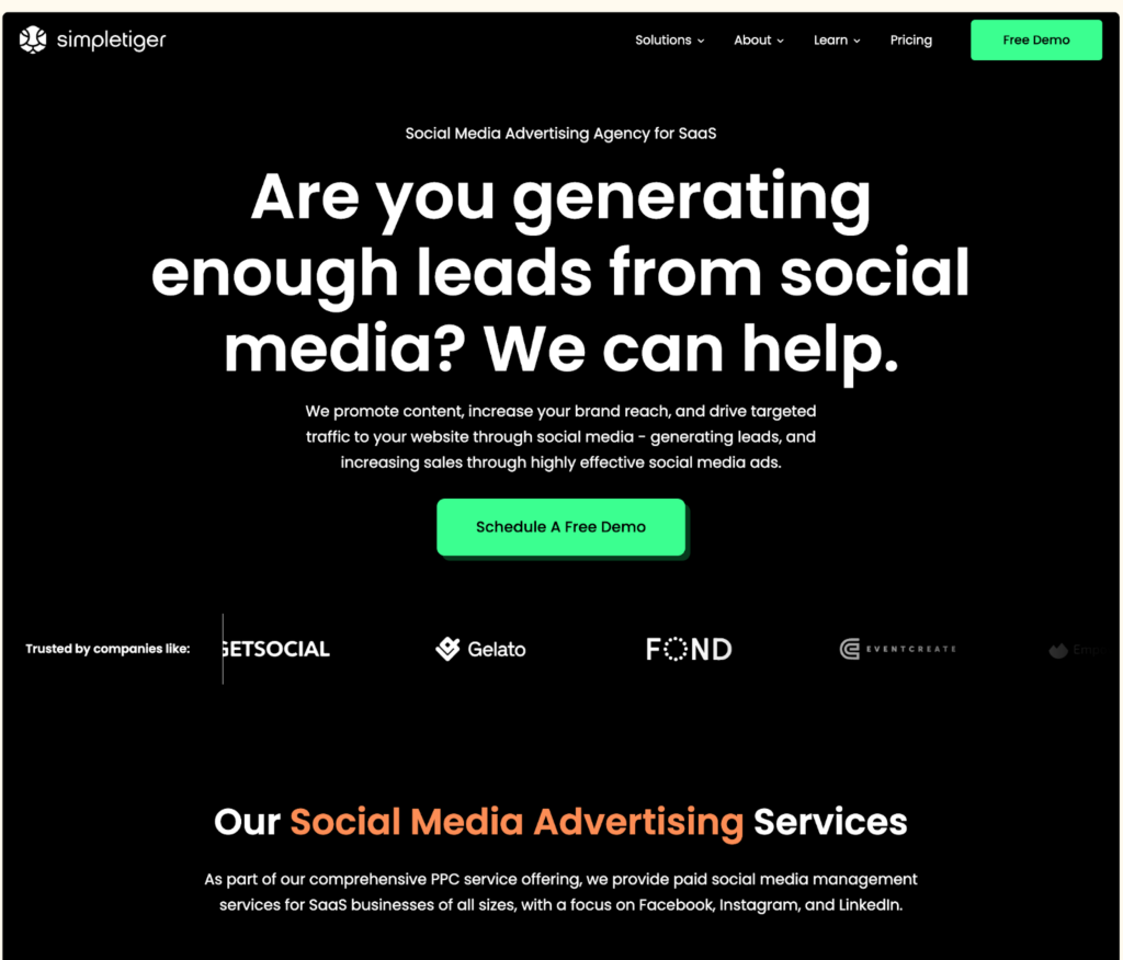
Link: SimpleTiger link here
About the page:
SimpleTiger focuses on SaaS growth. Their landing page centers around a free demo for businesses seeking predictable demand through content and SEO.
Why it converts:
- Pain-first headline: Addresses the core challenge—keeping the pipeline full.
- Audience empathy: Copy is respectful, clear, and message-matched to ad intent.
- Scanning-friendly layout: Bulleted benefits, short sections, and whitespace guide the eye.
- Persistent CTA: “Schedule Your Demo” appears at natural decision points.
SEO tip: Target terms like SaaS marketing agency, content marketing for SaaS, landing page SEO optimization to capture intent.
Key takeaway: Be clear, not clever. Lead with the problem, promise the outcome, and speak your customer’s language.
Best for: SaaS marketers, B2B startups, growth agencies.
3. KlientBoost – High-Converting Forms Done Right
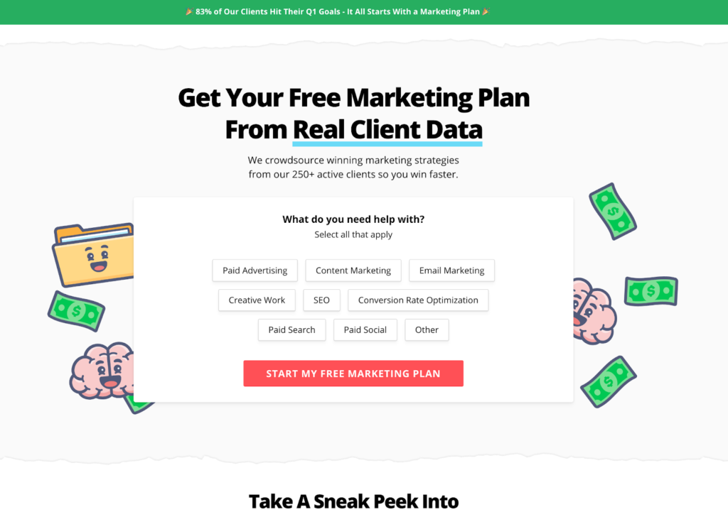
Link: KlientBoost link here
About the page:
KlientBoost offers a free marketing plan via a conversational, step-by-step form—no intimidating blocks of fields.
Why it converts:
- Breadcrumb UX: Starts with goals/channels, asks for contact only after engagement.
- Progress cues: A progress bar and microcopy reduce friction and boost completion rates.
- Value framing: Visuals + concise benefit chunks keep momentum high.
SEO tip: Build topical depth with related phrases like conversion optimization, paid media strategy, digital ad performance.
Key takeaway: Ask less, get more. Keep forms short, sequence questions like a helpful conversation, and earn the right to request contact details.
Best for: Performance marketers, PPC teams, audit offers.
4. Landed – Conversational Design That Converts
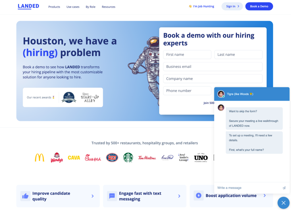
Link: Landed link here
About the page:
Landed connects employers to qualified candidates. Their landing page uses a chat-led flow that personalizes interactions and streamlines demo bookings.
Why it converts:
- Skip the form: Chat lets visitors self-educate, get answers, and book instantly.
- Human tone: Short, sharp copy and clear CTAs like “Book a Demo Now” reduce hesitation.
- Fast path to value: The layout reinforces speed, efficiency, and outcomes.
SEO tip: Target intent phrases like recruitment automation, AI hiring platform, demo booking optimization.
Key takeaway: If your ICP prefers conversations, chat-to-book can outperform forms. Keep a form fallback, but make chat the shortest path.
Best for: HR tech, recruitment firms, B2B SaaS.
5. HeyFriends – Video-Centric Landing Page Strategy
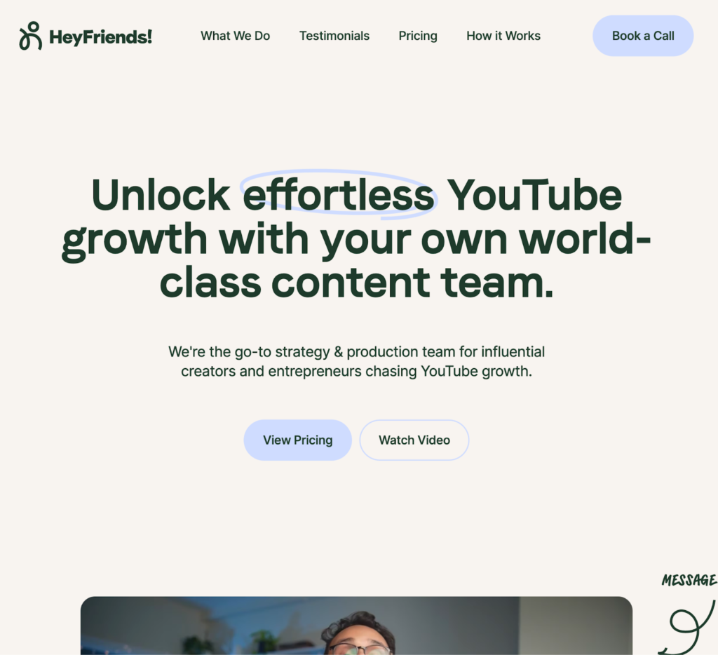
Link: HeyFriends link here
About the page:
HeyFriends helps brands grow YouTube channels. Their page blends video proof, interactive sections, and scroll-to-section CTAs (Book a Call / See Pricing / Watch Video).
Why it converts:
- Proof in motion: Short videos clarify the process and outcomes.
- Single-page flow: Jump links reduce exits by keeping users on-page.
- Visual hierarchy: Motion and thumbnails lead visitors through a narrative.
SEO tip: Add video transcripts below embeds to capture keywords like video marketing agency and YouTube growth strategy.
Key takeaway: Use video when it reduces uncertainty. Keep performance first: compress media and defer heavy assets below the fold.
Best for: Video marketers, creators, media agencies.
6. Major Tom – Minimalism That Speaks Volumes
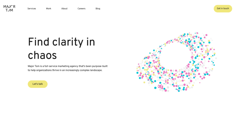
Link: Major Tom link here
About the page:
Major Tom is a strategy-led digital agency. Their landing experience pairs whitespace, light motion, and a plain-English CTA: “Let’s Talk.”
Why it converts:
- Less but better: Clean typography and spacing keep focus on the differentiator.
- Motion with meaning: Subtle animation supports the story rather than stealing attention.
- Strong narrative: “Clarity in chaos” resonates with overwhelmed decision-makers.
SEO tip: Reinforce the theme with LSI phrases like digital strategy, brand positioning, marketing clarity.
Key takeaway: You don’t need loud design to stand out. Use negative space and tight hierarchy to drive attention to the CTA.
Best for: Agencies, consultants, strategic services.
7. Fame – The Power of Eye-Catching CTAs
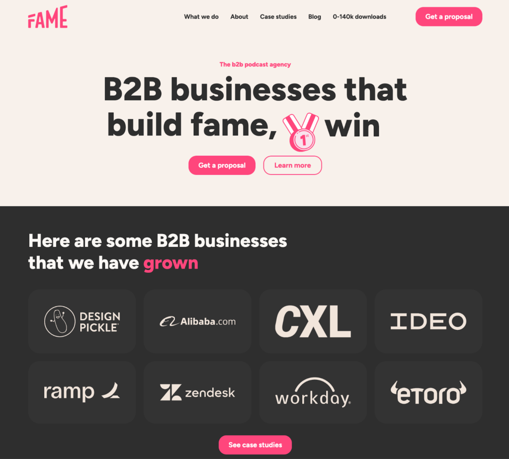
Link: Fame link here
About the page:
Fame helps B2B brands create and grow podcasts. Their landing page excels at CTA visibility and rhythm.
Why it converts:
- High-contrast buttons: A bold accent color pops against a neutral canvas.
- Visual rhythm: Cycling headlines and micro-graphics keep attention engaged.
- Proof snippets: Bite-size testimonials and logos enable fast trust.
SEO tip: Layer in phrases like podcast marketing agency, content growth strategy, B2B lead generation.
Key takeaway: Treat CTAs like a beacon. Nail copy + design + placement. Test contrasting colors and positions above the fold and at section ends.
Best for: Content teams, podcast platforms, B2B media.
8. Design Pickle – Unified Branding in Action
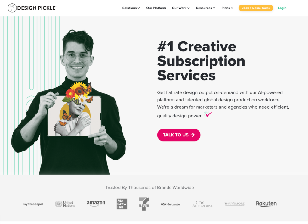
Link: Design Pickle link here
About the page:
A subscription creative platform that communicates value in seconds: “Unlimited Design Support for One Flat Rate.”
Why it converts:
- Outcome-first hero: Pain point solved in a single line.
- Stacked proof: Logos, testimonials, and case snapshots add credibility.
- One goal: Every section steers toward “Book a Demo.”
SEO tip: Mark up FAQ and Service schema to enhance SERP real estate and click-through rates.
Key takeaway: Align every block with your one conversion goal. If it doesn’t move users toward action, cut it or relocate it.
Best for: Design services, SaaS platforms, creative ops.
9. ConversionLab – Exit Popups That Save Lost Leads
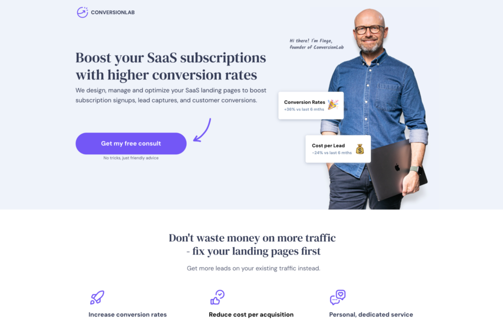
Link: ConversionLab link here
About the page:
ConversionLab combines behavior triggers (exit intent) with a personal brand touch to rescue abandoning visitors.
Why it converts:
- Save the bounce: Exit popups offer a free consult, audit, or resource at the right moment.
- Founder credibility: A human face and name increase trust for high-consideration services.
- Clean layout: Lightweight sections make the message effortless to digest.
SEO tip: Target high-intent queries like CRO agency, conversion rate optimization, landing page testing.
Key takeaway: Give visitors one last, valuable offer before they go. Keep the main page streamlined; let the popup do the recovery work.
Best for: CRO specialists, SaaS, lead-gen agencies.
10. Webistry – Educational Landing Pages That Sell
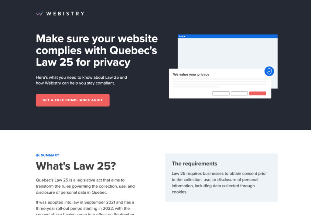
Link: Webistry link here
About the page:
Webistry uses an education-first approach for complex topics like privacy compliance (e.g., Law 25). The page simplifies risk, then offers a free audit as the next step.
Why it converts:
- Teach before you sell: Explains the problem, quantifies risk, then shows the fix.
- Single CTA: A focused “Get a Free Compliance Check” removes indecision.
- Urgency with clarity: Consequences are specific, benefits are concrete, tone is calm.
SEO tip: Long-tail keywords like privacy compliance landing pages, GDPR updates, website cookie audit win high-intent traffic.
Key takeaway: Education builds authority. When visitors understand the stakes, they’ll trust your solution and convert.
Best for: Legal tech, compliance SaaS, regulated industries.
Emerging Trends from These Landing Page Design Examples
- AI-driven personalization: Tailor headlines, sections, and CTAs based on source and behavior.
- Interactive UX elements: Sliders, multi-step forms, and scroll animations improve engagement signals.
- Microcopy & emotional hooks: Friendly helper text reduces anxiety at key friction points.
- Mobile-first everything: Most visitors see your page on a phone—optimize thumb zones and tap targets.
- Social proof at speed: Right-below-hero logo bars and compact testimonials build immediate trust.
- Compliance clarity: Clear consent patterns, cookie notices, and data intent messaging increase confidence.
Best Practices to Build Your Own High-Converting Landing Page
- One page, one job. Define a single conversion goal and remove competing links.
- Outcome-first headline. Lead with the value users get, not your features.
- Hero anatomy: Headline → 1-2 benefit bullets → primary CTA → fast proof (logos/badges).
- Design for speed: Optimize images, lazy-load videos, and keep render-blocking scripts light.
- Breadcrumb your form: Ask about goals first, contact info second. Show progress.
- Make CTAs unmissable: Contrasting color, action verbs, and logical placement after each value block.
- Teach before you pitch: A short explainer, mini-case, or checklist reduces fear and boosts trust.
- Use assistive proof: Numbers (ROI, time saved), recognizable brands, and brief testimonials.
- Recover exits: Trigger a helpful exit popup with a template, teardown, or free consult.
- Iterate relentlessly: A/B test headlines, hero imagery, form steps, and CTA labels. Measure time on page, CTR, and conversion rate.
Mini Frameworks You Can Copy
Hero Formula
Problem → Outcome (8–10 words) → Primary CTA → Trust marker (logos, rating, guarantee)
Section Rhythm
Value block → Proof block → CTA → Repeat (2–4 times)
Form Flow
Goal selection → Channel fit → Timeline/budget (optional) → Contact → Confirmation
Compliance Lite
Consent checkbox ▸ Privacy link ▸ Data purpose sentence ▸ Cookie notice ▸ Accessible design (labels/contrast)
How Pix DesignX Helps You Build High-Converting Landing Pages
At Pix DesignX, we specialize in creating conversion-driven landing pages that combine sleek design, data-backed strategy, and user-focused experiences. Our expert team doesn’t just make your pages look good—we ensure they perform flawlessly, guiding your visitors toward action with precision-crafted layouts, persuasive copy, and optimized CTAs.
Whether you’re a startup launching your first campaign or an established business ready to scale, we help you design landing pages that engage, convert, and deliver measurable ROI. From wireframing to final design, every page is tailored to your brand’s identity and business goals.
If you’re ready to elevate your online presence and build landing pages like the examples above, our team at Pix DesignX is here to help.
[Contact Us Today] to start building high-converting landing pages that attract, impress, and convert your audience effortlessly.
Final Thoughts
These Landing Page Design Examples prove a universal truth: clarity beats complexity. The best landing pages don’t just look beautiful—they understand human behavior, lower friction, and inspire immediate action.
When you craft your next page, remember:
- Lead with value.
- Design with empathy.
- Make every click effortless.
With the right blend of strategy, creativity, and testing, your landing page can become your most powerful growth asset—and Pix DesignX can help you get there.